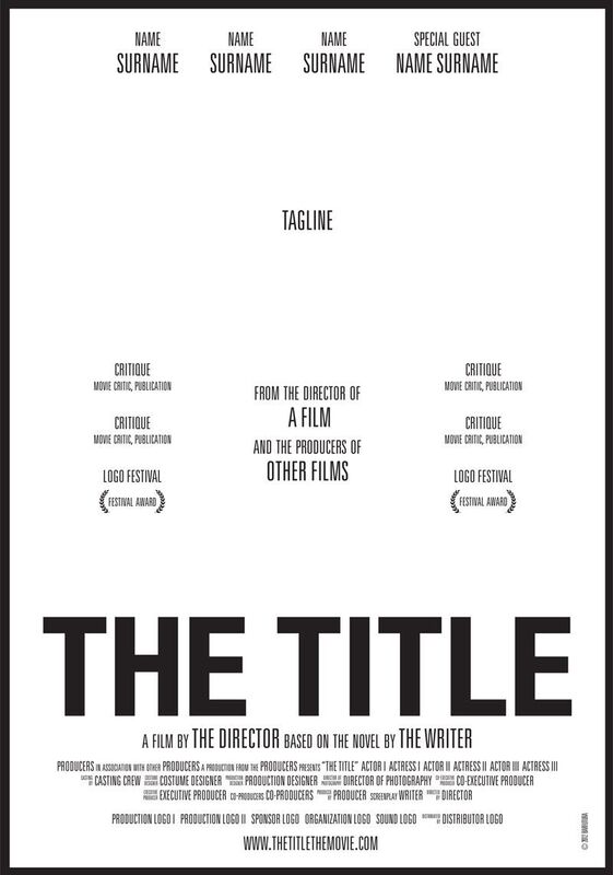
Creating the poster:
The ones showing above are the drafted posters that, unfortunately, didn't make the cut.
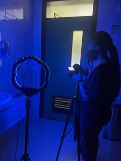
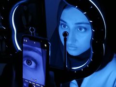
Photo-shoot for the poster:
|
|
Laying out the poster:
|
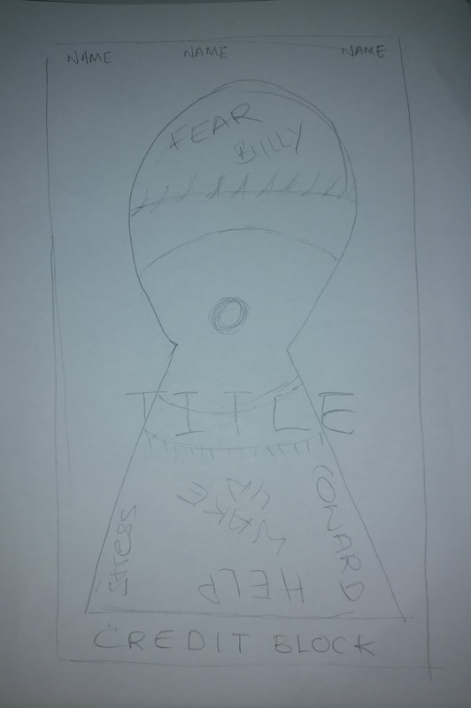
~We made a quick sketch, an idea on what we wanted our poster to look like.
~ In the main image, Noor is supposed to be dragged into dream/nightmare state. Shown by the fear in her eye , the keyhole form connotes travelling through doors, the gates of her own mind, which is a place of fear. ~ The words around her eye is the things her bullies say to her, or her inner voice. |
|
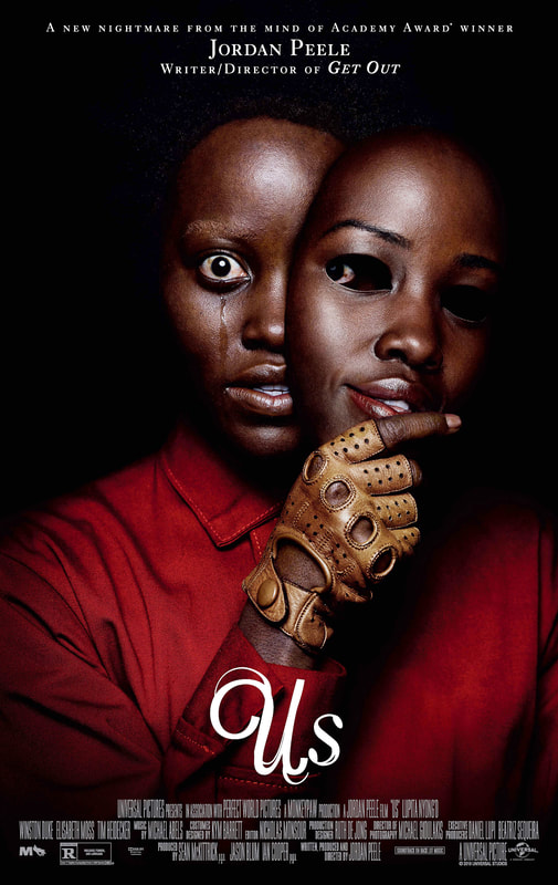
These are digital examples/inspirations we used:
|
|
Using Canva:
~ We decided to use Canva to create our poster since it was the most user-friendly and suited with our concept.
~ In the beginning, we came out with three ideas for how the poster would look, so we had a photo-shoot for all three types, then decided the close up with keyhole idea was the best- as our movie is based on the idea of opening doors to new nightmares..
~ We still made a draft for each look, just to have backups.
Details:
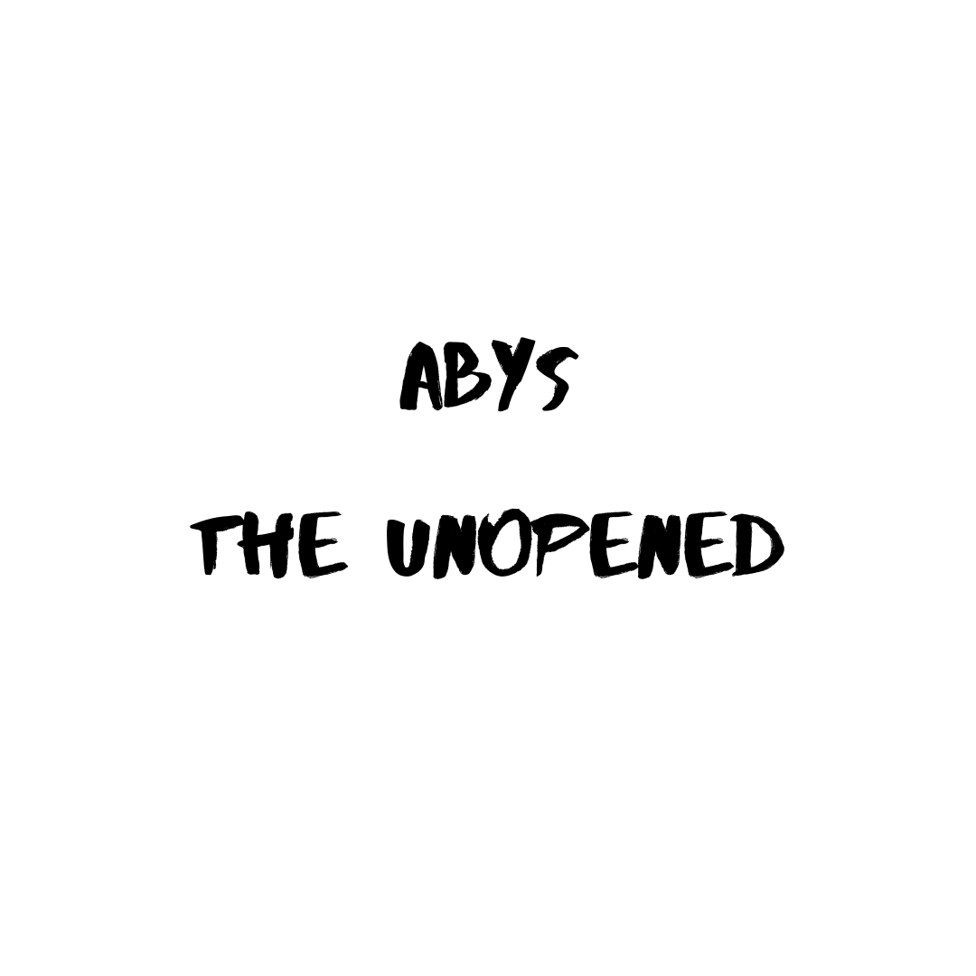
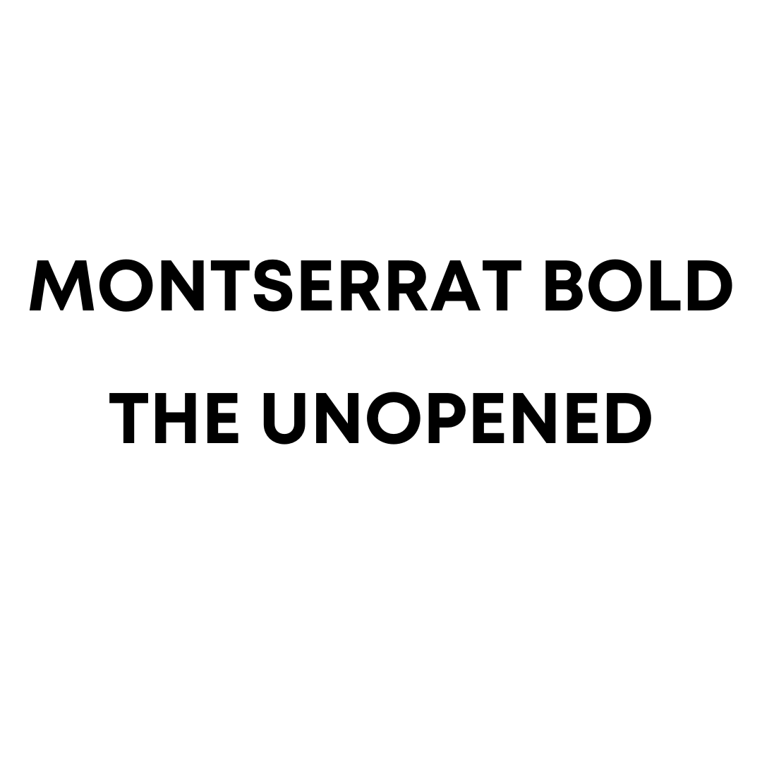
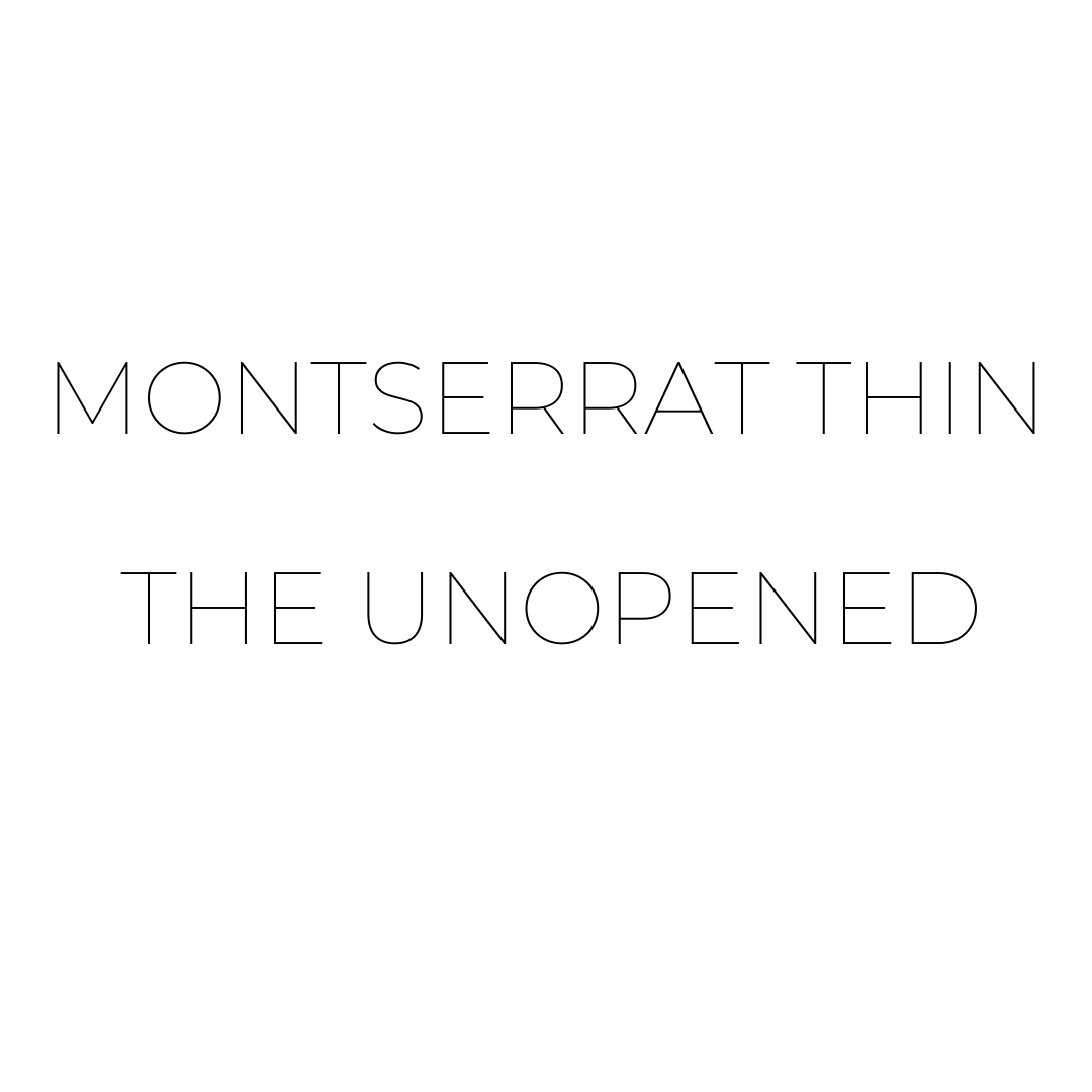
Font:
~ Canva provided a lot of inspiration for how we wanted to promote and publicise a film, especially to encourage people to see it in theatres. My teammate and I decided on three font styles for the poster and trailer title. Finally, Montserrat thin was chosen because it is the most ubiquitous and instils trust. Now, we tried to "trick" the audience, as even though its a font that represents "trust", we are luring them in into a suspenseful horror.
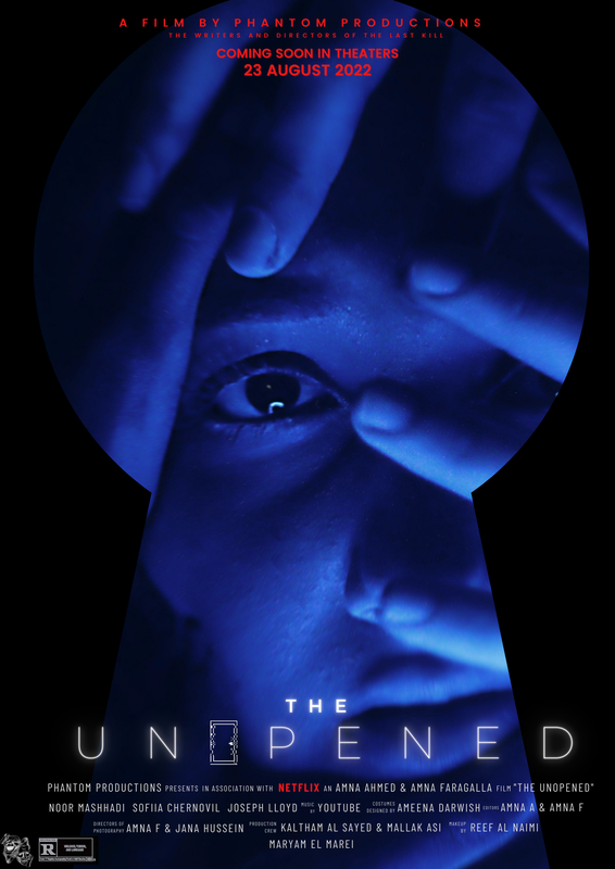
~ Our Instagram profile, poster, and headline are all blue and red, which may provoke feelings and familiarity in our readers. For example, our red and blue colour scheme made us appear secretive and hidden, luring folks who enjoy a rush of adrenaline. Though with our main poster, we used a "Neon" effect on Canva, where it creates a fluorescent light effect- we utilised this to emphasis the idea that our trailer is partly based on the idea of "lights". The glitched out "O" in "unOpened", done as a glitched door, is to implement the second idea of our trailer, which is "doors"- it is glitched out because it is meant to be partly disorienting and "dream-like" almost.
~ We also generated three drafts before landing on one that was visually appealing to the public and met all of the poster's specifications, including the tag line, credit, date, and large image.
Image:
~Main Image; Noor is supposed to be dragged into the "void," or dream/nightmare state, in the main image. The keyhole form connotes walking through doors, the gates of her own mind, which is a place of fear, as her facial expression suggests.
~ She had a faint glimmer in her eye, as if she was seeking for the light at the end of the tunnel- at the other side of the door.
~ Canva provided a lot of inspiration for how we wanted to promote and publicise a film, especially to encourage people to see it in theatres. My teammate and I decided on three font styles for the poster and trailer title. Finally, Montserrat thin was chosen because it is the most ubiquitous and instils trust. Now, we tried to "trick" the audience, as even though its a font that represents "trust", we are luring them in into a suspenseful horror.
~ Our Instagram profile, poster, and headline are all blue and red, which may provoke feelings and familiarity in our readers. For example, our red and blue colour scheme made us appear secretive and hidden, luring folks who enjoy a rush of adrenaline. Though with our main poster, we used a "Neon" effect on Canva, where it creates a fluorescent light effect- we utilised this to emphasis the idea that our trailer is partly based on the idea of "lights". The glitched out "O" in "unOpened", done as a glitched door, is to implement the second idea of our trailer, which is "doors"- it is glitched out because it is meant to be partly disorienting and "dream-like" almost.
~ We also generated three drafts before landing on one that was visually appealing to the public and met all of the poster's specifications, including the tag line, credit, date, and large image.
Image:
~Main Image; Noor is supposed to be dragged into the "void," or dream/nightmare state, in the main image. The keyhole form connotes walking through doors, the gates of her own mind, which is a place of fear, as her facial expression suggests.
~ She had a faint glimmer in her eye, as if she was seeking for the light at the end of the tunnel- at the other side of the door.
|
|
|
Final: The Unopened (movie poster)